Using Backgrounds

image of Concord Massachsetts

Autumnal greetings and welcome new followers, I really appreciate you being here xx

image of Concord Massachsetts

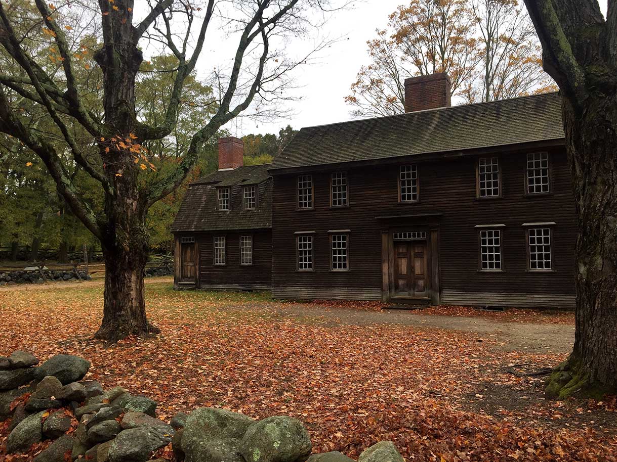
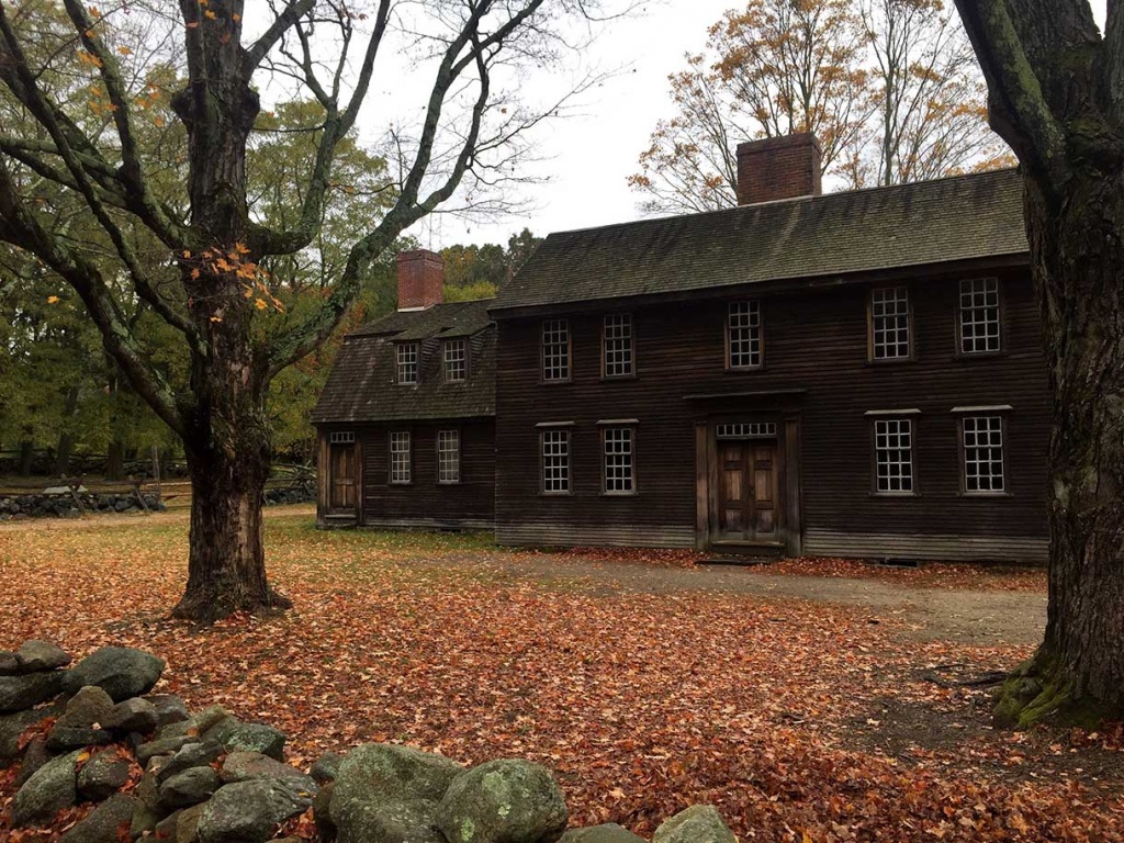
Just a beautiful pic of Fall in Concord, Massachusetts for you to enjoy

Y’know… I’ve been thinking about how you, my dear friends, can get more out of these blog posts.

How can I make them more informative and inspiring for you?

And if you’re not in near proximity to where I’m teaching (though that IS expanding), how can I share with you the fabric inspiration I talk about in my workshops?

As I’ve been stitching the Suffolk Coverlet (new), that pondering has been taking shape.

image of Hexies

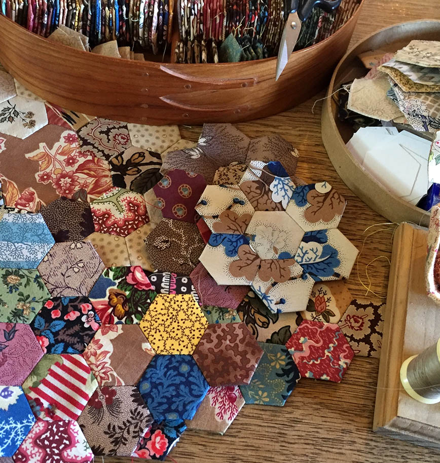
My nightly companion… Hexies for the Suffolk Coverlet

I realised I’ve actually been looking at what I want to share with you for months, it just took me a little time to figure it out.

It’s *Backgrounds* and how I…

Choose what I’ll use,

and use what I choose.

And why?

image of Antique fabrics

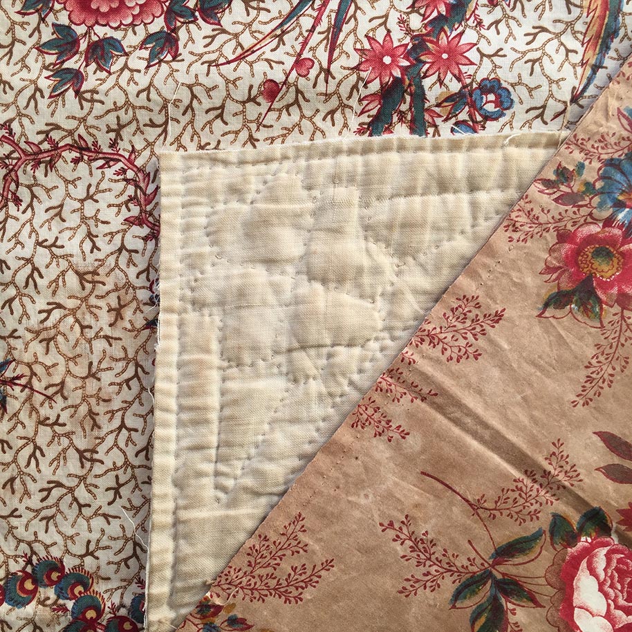
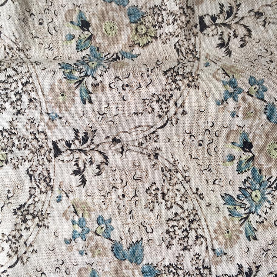
See that patina? … the blotches and age stains? Simply put… that just rocks my boat.

In ‘Quilts From the Colonies’ I talk about the nostalgia and familiarity I felt (even as a child) looking at antiquities.

 I don’t really know *why*it*moves*me*… but it does.

There’s just something about old stuff and how it makes me feel.

Old, faded, battered & stained = Well used (loved), handled & cherished by generations and it has a history.

image of Antique blocks

A few more from my collection… I buy these just because they make me feel all warm amd fuzzy inside.

So of course… I want to get that *look*.

I just want it to look like this.

image of antique quilt

In earlier days my MO was to Tea Stain pretty much any background print,

and any print that had white,

and any print that had too high a contrast going on.

I loved the print and I loved the colour, but I didn’t always love the colour value.

Vintage Sampler 2005

Vintage Sampler 2005

Vintage Sampler 2005

Vintage Sampler 2005

 I would also use the wrong side of fabrics to tone things down a bit.  I wanted to flatten out that high contrast.

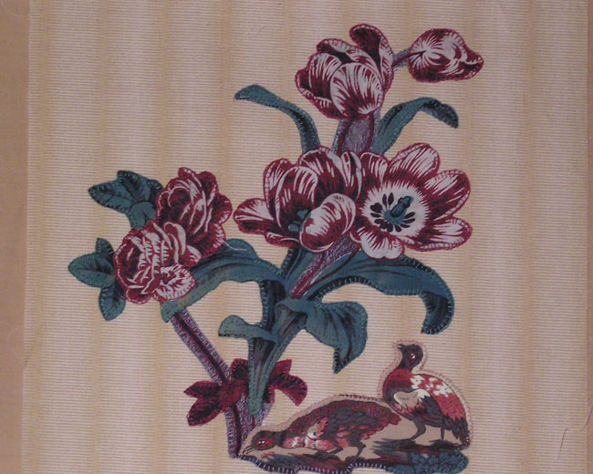
This pic shows what I was wanting to achieve, and my love affair with brown.

Antique fabric
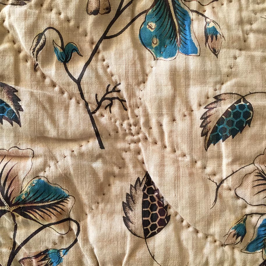
There’s contrast here (above), but the background has discoloured and now sits (imho)  more calmly against the print.

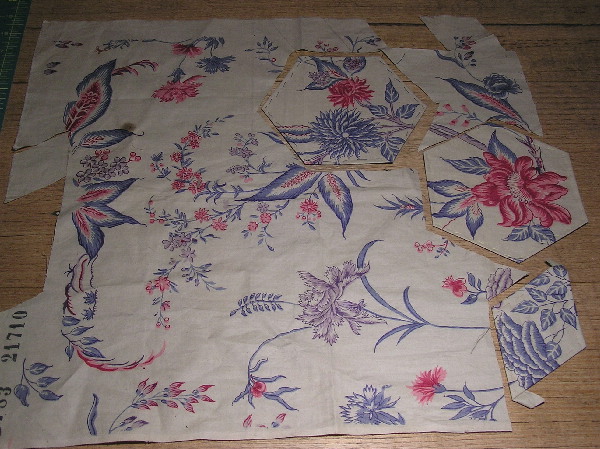
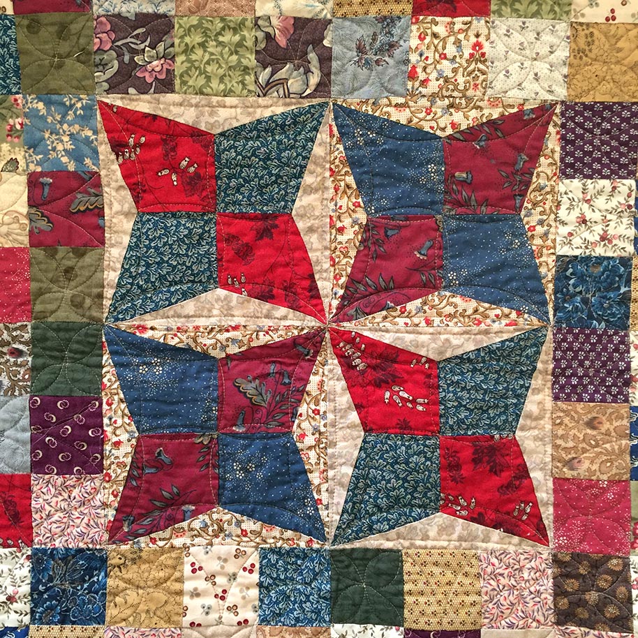
Below is a recent finish where the print evokes the same feelings of calmness and nostalgia.

Indiana Medallion 2018

Indiana Medallion 2018

Quantities permitting, if I’m using a plain fabric my absolute preference would be to use a tea stained fabric.

Left. Patty Harants print (Gold Star for that one) and Right. Marcus Bros Aged Muslin

Left. Patty Harants print (Gold Star Miss P for that one) and Right. Marcus Bros Aged Muslin

 There’s a few that are commercially available.  Alas the Patty Harants fabric above left is from years ago.  But the Marcus Bros Aged Muslin is one I have used in many quilts, it’s a standard line for them and comes in many different tones from off white through to brown. And just FYI, it comes in colours too.

But what I’ve been doing with the Suffolk Coverlet is …

Anne Romsey's Coverlet c 1790 Dedham Essex/Suffolk

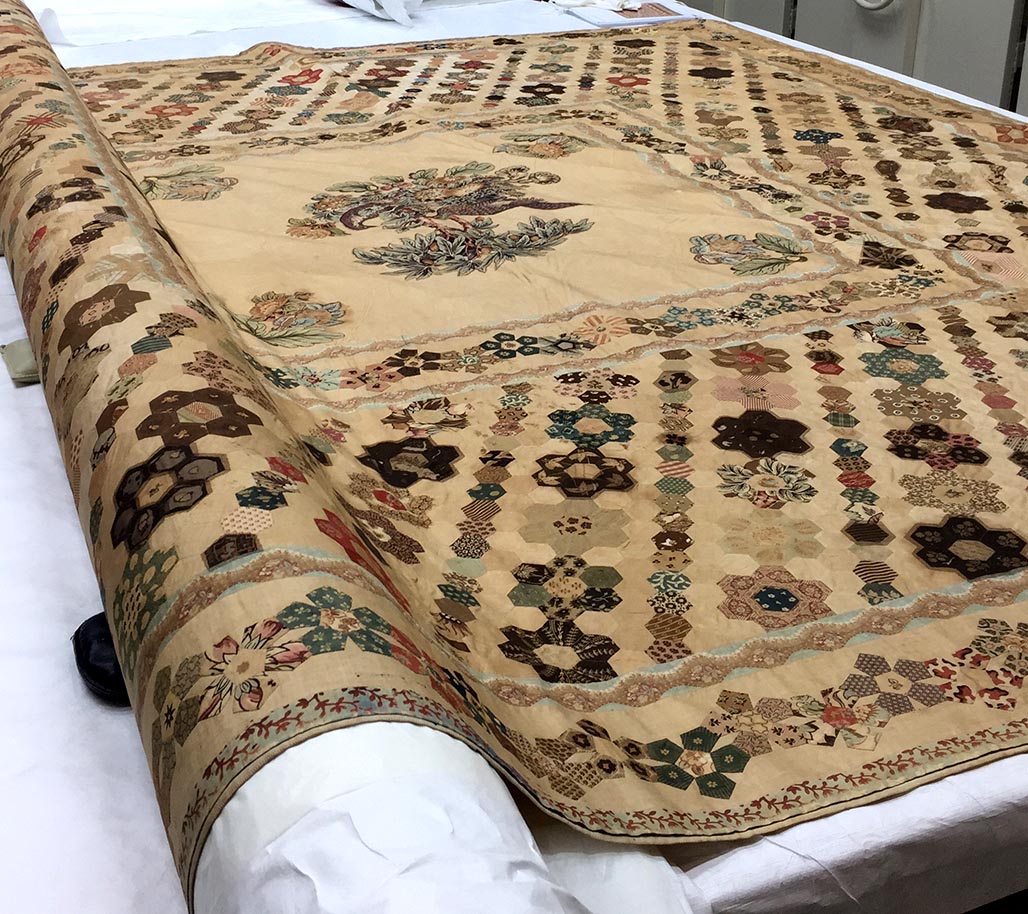
Anne Romsey’s Coverlet c 1790 Dedham Essex/Suffolk

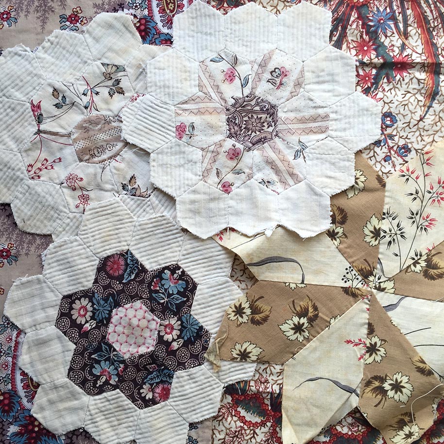
…using tone on tone prints to create the look of random discolouration, or patina.

Suffolk Coverlet backgrounds
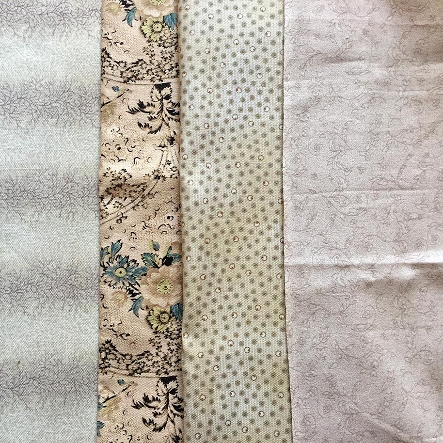
Why did I decide to use these four fabrics?

Far right is the background for the centre Broderie Perse appliqué … not a lot left so can’t use that.

Far left is the background to the Pentagon border … didn’t have a huge amount left but have since sourced more from Margo Krager.

But I didn’t want to just switch from one background fabric in the centre, to using a whole other background for the rest of the quilt because I think that is too big a jump, I want to blur the meeting point.

So as well as repeating the two already used, I added the tiny spot… tonally and scale wise the three are similar.

But what’s with the fourth? Why is that fabric there?

FabricBecause I like it,

Actually, I love it.

Because I have only a few off-cuts left and it’s been in a couple of my favourite quilts already (and I have a feeling this one is going to be another favourite quilt)

Because  I think every quilt should have something that doesn’t quite fit… but you love it and that’s all that matters.

And because I don’t want to make the *obvious* fabric choices in my quilts…

and may I be so bold as to say,

I don’t think you should make the obvious choices either.

Please use the fabrics that give you joy, and make you feel all warm and fuzzy inside.

Making shapes and sttiching them together

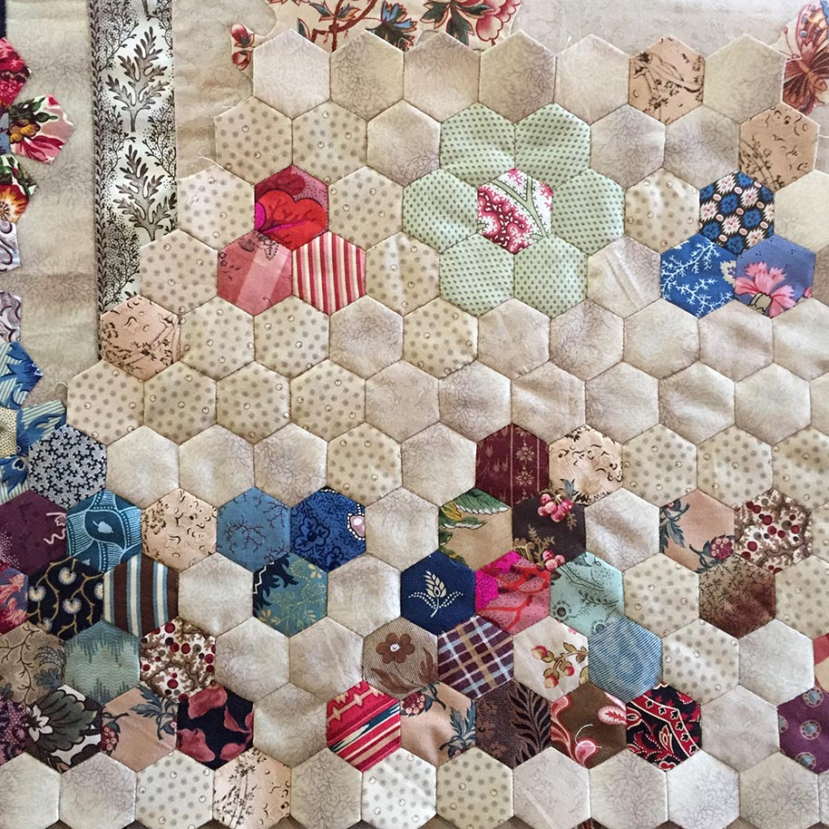
Making shapes and stitching them together.

More hexies

The four ‘background’ prints are totally random. No rhyme or reason to it at all.

Hexie Rosettes of all colours and prints

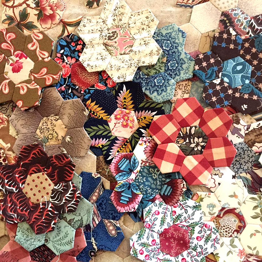
Hexie Rosettes of all colours and prints.

I’m so sorry this has been quite a mammoth post, I hope you’re still here til the end.

As I don’t have time to blog as much as I’d like, I’m wanting to offer you quality over frequency… I want to share fabric choices with you on a deeper level than just showing pretty quilt pictures.

I really hope I haven’t bored you.

Thanks for sticking with me

Til next

Happy stitching

Margaret xx

Vintage Fabric

Vintage Fabric

I wish I could find my receipt for the vintage fabric I bought a few years ago…it will turn up sometime and as soon as it does I’ll show it to you.

In the meantime, as promised in an earlier post, here are some more photo’s of another of the vintage fabrics I bought in Bath, U.K. in 2006.

This one is the fabric I paid the most for (10 pounds) but it was the one that caught my eye first and is most definitely my favourite of the four pieces.

Vintage Fabric

Sarah Morrell Quilt/unpieced block

I have used quite a bit of it in the Sarah Morrell Quilt.  Di Ford reproduced this antique quilt from 1843 and it was a very popular ‘Block of the Month’ through Threadbear Quilters in Castlemaine 2 years ago.  I signed up to make the quilt but have yet to finish it (I have quilted a couple of Morrell quilts for customers though, so there is no excuse for my lack of motivation… it is gorgeous when finished).  Actually, Di’s Sarah Morrell and my Mid 19th C Star are holidaying together at Petra Prins place in the Netherlands…lucky quilts, they get to have all the fun.

So, I used it in this unpieced block and also some Broderie Perse and a pieced and appliqued Star block.

Vintage Fabric

Sarah Morrell Quilt/Broderie Perse block.

Vintage Fabric

Sarah Morrell Quilt/ pieced and appliqued star block

Then I still had a bit left and decided to use some in the Hexagon Quilt I am working steadily on for next year’s  Vic. Quilters ‘Fabric of Society’ Challenge.

Vintage Fabric

Bits ready for the Hexagon Quilt

And that has virtually used it up, I only have the littlest bits left for Applique and those precious pieces live in the box labelled ‘Vintage and Smithsonian Scraps’.

It would have been a fabulous fabric for ‘fussy cutting’ but just way too precious to to do that and leave unusable holes in it.

Colour wise, this fabric is a true ‘Perkin’s Purple’, which was a dyeing method/colour developed in 1856, and probably dates from around then or up till the end of the 1800s.  Even though it doesn’t have any holes, it feels slightly brittle…as if one good pull and it would tear like tissue.

Vintage Fabric

This is what's left...precious scraps

Tonight I’ll be working on some more hexagons in front of the fire, it’s been cold and bleak here today and because I finished a customer’s quit today, I can curl up with my own sewing…bliss.

Thanks for visiting…

To cut or not to cut…’Snipping’ into Vintage Fabric

Vinatge Chintz Sample

A couple of days a go I mentioned a piece of vintage fabric I bought in the UK  a few years ago (oooh 2006…more than a few) and that I had cut into it for a hexagon quilt.   Well before I get carried away with more cutting I decided I had better photograph it (or I might really regret my impulsiveness) and share it with you.  Here it is…I’ve placed my Hexagons back where they were cut from in a feeble attempt to show what it looked like before I got scissor happy.

And I thought you might like to know more about it.

Vintage Chintz Sample

In Aug 2006 I went to Bath to see the American Museum… I just went to see the beautiful quilts in the Museum’s collection and had no idea my visit had coincided with an Antique Textile Fair.  There were lots of vendors selling all manner of vintage laces, beads, embroidery, fabrics and quilts, yes Quilts.   However at the time it cost about AU$2.50 to buy a pound (yep, one quid) so the quilts were beyond my reach, especially as it was just at the start of a 2 month vacation.

Anyway,  there was one vendor from whom I bought four lovely pieces and this chintz sample is one.  I must dig out the receipt when I’ve got a minute and show it another time.  I think I paid 5 pounds for it, it measures (or should I say measured!) 17″ x 21″ and has numbers stamped on the top edge as if it had been a sample.  It has only one rust spot and is in good condition.  It definitely has a chintz feel to it but is not highly glazed…just a nice amount.

I’ve really enjoyed having this piece in my stash  and over the last 4 years I’ve looked at it (and the others) many, many times and wondered if I’ll do anything with it or just keep it intact and look at it.

Then about six weeks ago I decided to start a Hexagon Quilt with the plan to entering the Vic. Quilters Inc. “Fabric of Society” Challenge for 2011.  The challenge is to reproduce a quilt from (or create a quilt inspired by) any quilt shown in (Australian Quilt Historian) Annette Gero‘s book  The Fabric of Society, Australia’s Quilt Heritage from Convict Times to 1960.

So I thought the Hexagon Quilt was worthy of using some vintage fabrics  (yes, I confess I have cut into the other 3 and yes I will also photograph what’s left of them before I go any further…I promise).

Hexagon using vintage fabrics

Here’s the quilt in progress, pinned on the design wall.  Of course, at the beginning I just started randomly (impulsively) making hexagons out of my favourite fabrics but since Saturday I have started in the middle…I guess that’s where a sane person would begin a hexagon quilt.

The purple fabric in the centre is another of the vintage fabrics I bought in Bath (I’ll tell you more about that one another day…it’s particulary gorgeous and I’m using it in Di Ford’s  Sarah Morrell Quilt) and so is the brown and purple cameo print in the bottom left corner.

Thanks for visiting.