Autumnal greetings and welcome new followers, I really appreciate you being here xx
Y’know… I’ve been thinking about how you, my dear friends, can get more out of these blog posts.
How can I make them more informative and inspiring for you?
And if you’re not in near proximity to where I’m teaching (though that IS expanding), how can I share with you the fabric inspiration I talk about in my workshops?
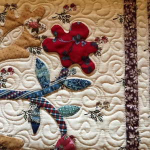
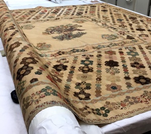
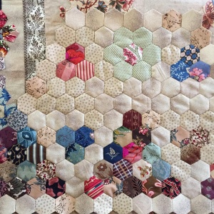
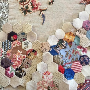
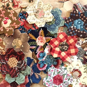
As I’ve been stitching the Suffolk Coverlet (new), that pondering has been taking shape.
I realised I’ve actually been looking at what I want to share with you for months, it just took me a little time to figure it out.
It’s *Backgrounds* and how I…
Choose what I’ll use,
and use what I choose.
And why?
In ‘Quilts From the Colonies’ I talk about the nostalgia and familiarity I felt (even as a child) looking at antiquities.
I don’t really know *why*it*moves*me*… but it does.
There’s just something about old stuff and how it makes me feel.
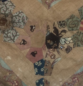
Old, faded, battered & stained = Well used (loved), handled & cherished by generations and it has a history.
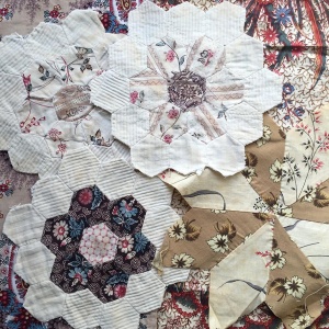
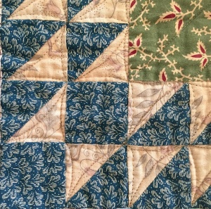
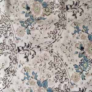
A few more from my collection… I buy these just because they make me feel all warm amd fuzzy inside.
So of course… I want to get that *look*.
I just want it to look like this.
In earlier days my MO was to Tea Stain pretty much any background print,
and any print that had white,
and any print that had too high a contrast going on.
I loved the print and I loved the colour, but I didn’t always love the colour value.
I would also use the wrong side of fabrics to tone things down a bit. I wanted to flatten out that high contrast.
This pic shows what I was wanting to achieve, and my love affair with brown.
 There’s contrast here (above), but the background has discoloured and now sits (imho) more calmly against the print.
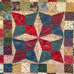
Below is a recent finish where the print evokes the same feelings of calmness and nostalgia.
Quantities permitting, if I’m using a plain fabric my absolute preference would be to use a tea stained fabric.
There’s a few that are commercially available. Alas the Patty Harants fabric above left is from years ago. But the Marcus Bros Aged Muslin is one I have used in many quilts, it’s a standard line for them and comes in many different tones from off white through to brown. And just FYI, it comes in colours too.
But what I’ve been doing with the Suffolk Coverlet is …
…using tone on tone prints to create the look of random discolouration, or patina.
 Why did I decide to use these four fabrics?
Far right is the background for the centre Broderie Perse appliqué … not a lot left so can’t use that.
Far left is the background to the Pentagon border … didn’t have a huge amount left but have since sourced more from Margo Krager.
But I didn’t want to just switch from one background fabric in the centre, to using a whole other background for the rest of the quilt because I think that is too big a jump, I want to blur the meeting point.
So as well as repeating the two already used, I added the tiny spot… tonally and scale wise the three are similar.
But what’s with the fourth? Why is that fabric there?
Actually, I love it.
Because I have only a few off-cuts left and it’s been in a couple of my favourite quilts already (and I have a feeling this one is going to be another favourite quilt)
Because I think every quilt should have something that doesn’t quite fit… but you love it and that’s all that matters.
And because I don’t want to make the *obvious* fabric choices in my quilts…
and may I be so bold as to say,
I don’t think you should make the obvious choices either.
Please use the fabrics that give you joy, and make you feel all warm and fuzzy inside.
I’m so sorry this has been quite a mammoth post, I hope you’re still here til the end.
As I don’t have time to blog as much as I’d like, I’m wanting to offer you quality over frequency… I want to share fabric choices with you on a deeper level than just showing pretty quilt pictures.
I really hope I haven’t bored you.
Thanks for sticking with me
Til next
Happy stitching
Margaret xx
